
Example
of Historic Accuracy (or not!)
Postcards were at
their height of popularity
from about 1905 through the 1950s. Early view cards
were based on a photograph or artist's rendering, and printed from a
hand colored master
original. In those hand colored images, you will see great
attention to detail and shades and colors. Others may be machine
printed, and in those, you'll often see broad swaths of color, with
some areas with no color at all. Many early cards were finished
in Germany, by artists
who never saw the
subject. They used their artistic creativity, sometimes
referencing common finishing detail of European buildings. It's
not
unusual to find two cards of the same view but colored very
differently.
While I will sometimes correct an image
if the color of one object has
bled over into an adjacent object, I try not to second guess the
overall color scheme created by the original artist. Because I
am interested in late 19th century architecture, sometimes I research
the buildings depicted. However, I do not attempt to match the
postcard image to the description of the original building.
Below is an example of how a color
postcard may did not represent reality. This postcard
of Stone Mountain in Georgia may look much like
a
tinted photograph, but note that the carving includes five main figures
with the Confederate army in the back ground (an early conception of
the memorial).
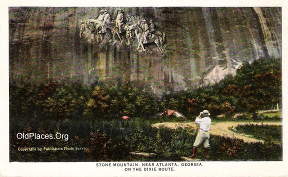
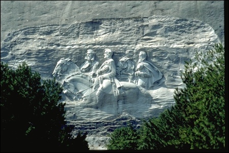
After decades of starts and stops on the
carving, the final sculpture includes larger images of only
Robert E. Lee, Stonewall Jackson, Jefferson Davis (see
below). The actual granite
carving measures approximately 90 feet high, 190 feet wide, and 12 feet
deep. Three sculptors have been involved in the project, from
1867-1998 (with many gaps in the process). This is just one
of thousands of examples of postcards which depicted a
"future" scene or building, not reality at the time of their
creation.
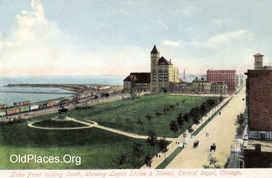
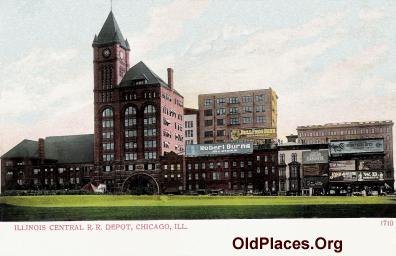
ILLIOIS
CENTRAL RAILWAY DEPOT
I love this Chicago
building, and have collected several Illinois Central cards. I
have not found any two cards colored exactly the same way.
Below are two from my collection. I think the closest to
"reality" is the bottom card, but the one on tope is so gorgeous, I
couldn't bring myself to "correct" the color of the depot.
Another consideration in historic accuracy is the age of the photograph
from which the postcard was created. Often, the original image is
several years older than the postcard.
|